
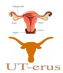
The other day I was perusing a graphic design blog and came across a post about logo fails — typically defined as logo designs that communicate something other than the intended message. Ideally, logos are designed to distill a brand’s message down to a simple glyph. But, like Rorschach tests, simple glyphs are open to interpretation — for example, a longhorn that looks like a uterus.
But the fails presented were more nuanced than visual miscommunication. I’d be inclined to call these branding fails. The logos and word marks are just a visual manifestation of branding missteps. Rebranding that thumbs its nose at brand equity — or obfuscates identification altogether — isn’t the logo’s fault as much as it was the fault of the concept itself.
During my job search I came across a company that had rebranded to the point of identity obfuscation, and the blog post ties in nicely.
The article mentions several examples, starting with Dunkin’ Donuts. The brand dunked the word ‘Donuts’.
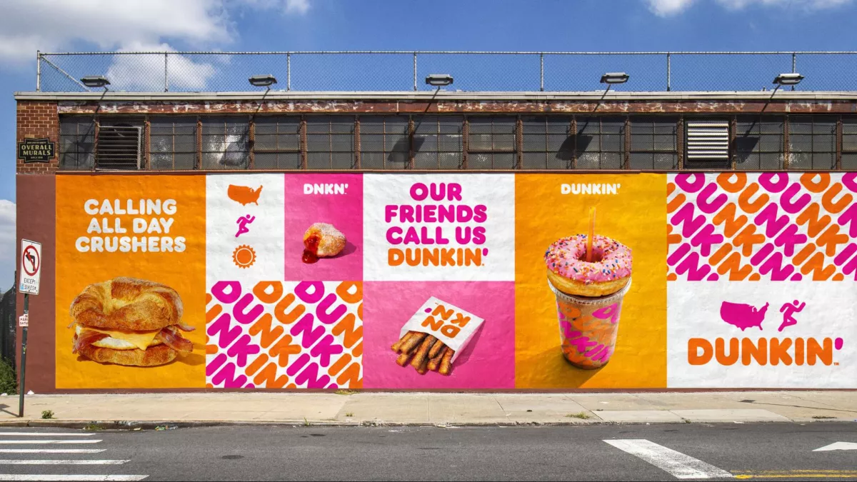
I don’t think this is especially egregious. The key components of the identity — the color palette, the puffy donutty font, and of course the name Dunkin’ — make it instantly identifiable. And dropping the word donuts when donuts are relegated to a lesser role in your product assortment makes sense.
Travel Channel reduced its logo to ‘Trvl’ (for the last decade or so it was universally agreed that vowelless branding was cool and trendy).
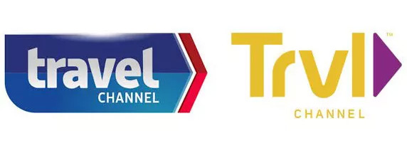
Was cool and trendy achieved with the change? Not so much.
And the post showed how Weight Watchers not only eighty-sixed vowels, it removed all but the initials — reducing their logo to a stacked ‘WW’ in a circle. FAT Ws no less!
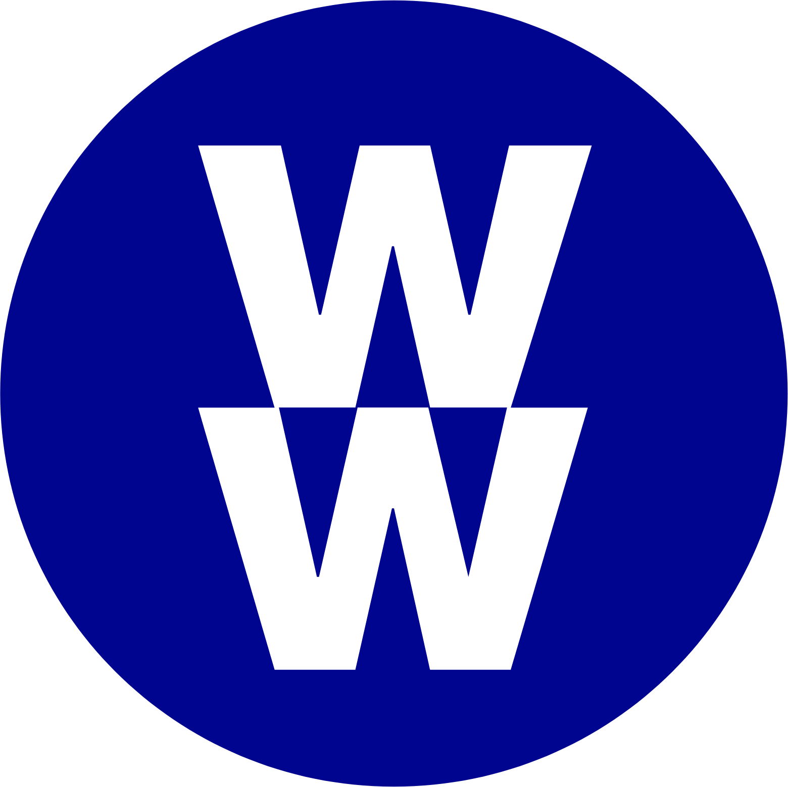
They could have used a fat W and a svelte or height/weight proportionate W to indicate transformation. Maybe two Ws that adhere to commonly accepted insurance BMI tables. But no — these are the boldest of the bold — heavy (as in font weight) in fact! Helvetica Obese? I wish they had used a rule/laparoscopic gastric band between the Ws. Now THAT would be a logo fail.
EY why?
Mere days after reading the blog post, I came across yet another brand that had truncated its brand beyond recognition…
I was perusing job postings on LinkedIn — because that’s what unemployed designers do when they aren’t sleeping or reading blogs — and I came across a job with a company called EY.
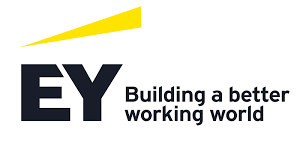
I noticed their posting earlier in the week, but I didn’t apply because I couldn’t for the life of me figure out what they did — even after reading their LinkedIn page. But, as I had run out of jobs to write cover letters for, I revisited the position and decided to try a little harder. I read their LinkedIn page again because maybe my comprehension was at fault. No… I still couldn’t tell what the company did. I think their narrative was written by ChatGTP — it was packed with generically broad generalizations. (Is “generic generalizations” redundant?)
I Googled ‘EY’ and — BINGO — Ernst & Young! Accountant!! (I mean the professional services entity that offers various business consulting services so it’s no longer just an accountant). I could relate to that on some less than abstract level. Cover letter away.
But EY?! Seriously??
And re the tagline, how about EY: A better working world? EY: Working, better?