It’s interesting (to me at least) to see design trends come and go—their reemergence (recycling?) due to a new crop of young, trend conscious designers. One such hot design trend is minimalism. I’ve always appreciated, preferred, and utilized minimalism—often a combination of prominent “Swiss/grotesque” type and generous compositional use of white space—so I’m excited to see it come back in vogue. In addition to whitespace, there’s black and white photography and its colorful counterpart, duotones (using 2 colors to replace black and white). A fantastic expression of this aesthetic is a new campaign by Sonos, the fancy wireless speaker company.
An article in my news feed from WIRED magazine grabbed my attention because I have a pair of Sonos (Sonoses? Soni?). Yesterday, Sonos launched their own music service. What struck me though were the graphics promoting “curated music stations”—black and white photos of David Byrne, Brittany Howard, and Thom Yorke framed with minimalist type. The Sonos logo, turned 90 degrees clockwise running down the lower right edge, closes the frame (this appears to be the logo orientation on new hardware as well).
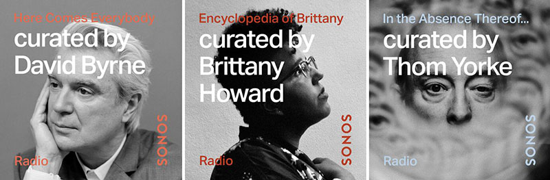
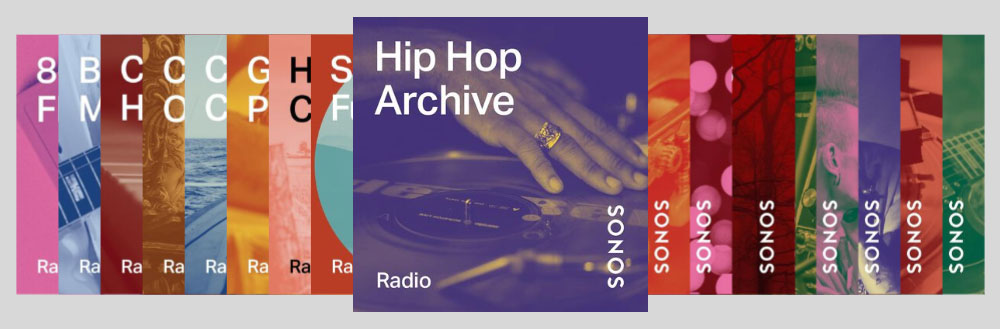
This is so much like stuff I’ve designed in the past (though not as well executed) it blew me away. Then I clicked through to the Sonos site and BOOM—even more retro minimalist coolness: themed stations depicted in the same layout, using monotones and duotones! How cool!! I haven’t used a duotone since 1998. ¯\_(ツ)_/¯
Spotify did something similar but less retro back in 2018.

Who would have thought that in the age of hipster beards, minimalism would be a resurgent design trend? When there’s a yin there’s a yang. Helvetica coexists with calligraphic scripts and hand drawn typestyles. Due to the idea of brands expressing their attributes with as few words as possible—through a humble logo—dichotomies like this make sense.
I’m totally onboard with this trend despite my clean shaven countenance. The trouble for me may be finding a client with a brand that supports the style.
As if to blow my mind even further, the Sonos site has a lifestyle shot of a desk with a melamine top. No, not perfectly pristine white melamine. We’re talking an orange squiggly geometric pattern (think Cheetos Puffs) that harkens back to Memphis. YIKES! Some design trends really don’t need to see a resurgence.